
Color Wheel & Color Theory Guide 2026
Key takeaways
- ▸The color wheel organizes colors by their relationships. Primary colors (red, yellow, blue) form the foundation.
- ▸Secondary colors come from mixing primaries.
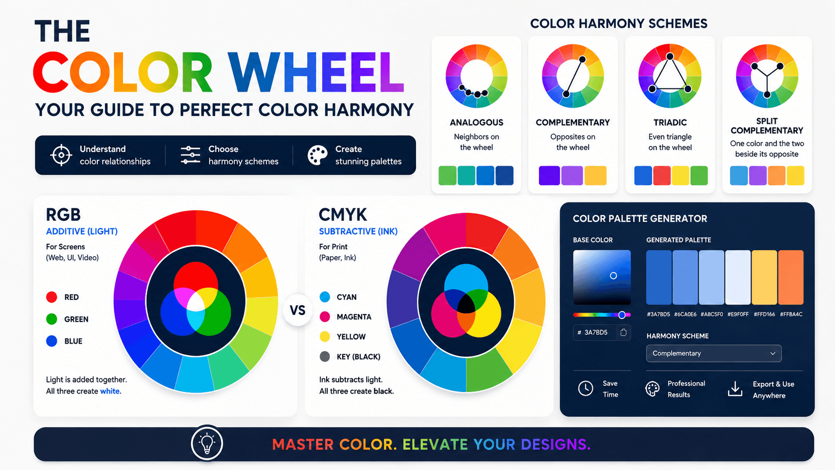
- ▸Use proven schemes like analogous (neighbors), monochromatic (single hue variations), triadic (even triangle), and split complementary for reliable harmony.
- ▸Combine this knowledge with a Color Palette Generator for fast, professional results.
The Complete Color Wheel & Color Theory Guide: Mastering Palettes in 2026
Color is one of the most powerful tools in design, art, branding, interiors, and digital experiences. The right palette captures attention, evokes emotion, and builds instant recognition. The wrong one creates visual noise or boredom. This comprehensive color wheel and color theory guide delivers the depth, practical techniques, and 2026 trends you need to create harmonious, effective palettes with confidence.
What Is a Color Wheel?
The color wheel is a circular diagram that arranges colors according to their relationships. Sir Isaac Newton created the first version in 1666 by mapping the visible spectrum into a circle. Modern chromatic wheels and primary color wheels remain essential references for artists, designers, and anyone building palettes.
A standard 12-step wheel clearly shows geometric relationships. Colors next to each other feel harmonious. Colors opposite each other create strong contrast. These relationships form the foundation of every reliable color scheme.
Digital tools often use RGB or HSL wheels, while traditional painters prefer the RYB (Red-Yellow-Blue) model. Understanding both helps whether you work on screen or with physical media.
Primary, Secondary, and Tertiary Colors
Primary colors cannot be created by mixing other colors. In traditional art, they are red, yellow, blue. These form the absolute foundation of the wheel.
Secondary colors (also called colours secondary or colour secondary) result from mixing two primaries in equal parts:
- Red + Yellow = Orange
- Yellow + Blue = Green
- Blue + Red = Purple / Violet
Tertiary colors add richness and nuance. They form when you mix a primary with a neighboring secondary (red-orange, yellow-green, blue-violet, etc.).
Mastering primary colors and secondary colors is the essential first step before exploring advanced schemes.
Warm Colors vs Cool Colors
Colors naturally divide into two temperature groups that greatly influence mood:
- Warm colors (reds, oranges, yellows) feel energetic, inviting, passionate, and friendly.
- Cool colors (blues, greens, purples) feel calm, professional, refreshing, and trustworthy.
Skilled designers use temperature to control emotional response and create depth. Warm accents on cool backgrounds pop forward. Cool tones recede and create space.
The Essential Color Schemes
These proven formulas, derived from the color wheel, deliver reliable harmony:
1. Monochromatic Color Scheme
Variations of a single hue using tints (add white), tones, and shades (add black). Best for: Elegant, minimalist, sophisticated branding, clean user interfaces, and calming interiors. Extremely safe and cohesive.
2. Analogous Colors / Analogous Color Scheme
Three to five neighboring colors on the wheel (for example: blue, blue-green, green). Best for: Natural, harmonious, relaxing palettes. These schemes appear frequently in nature and work beautifully for websites, illustrations, and landscapes.
3. Triadic Colors
Three colors evenly spaced around the wheel, forming a perfect triangle (classic example: red, yellow, blue). Best for: Vibrant, balanced, energetic designs. Triadic palettes feel dynamic yet harmonious and suit creative brands and illustrations.
4. Complementary & Split Complementary Colors
Complementary colors sit directly opposite (red-green, blue-orange) for maximum contrast. Split complementary colors / split complementary color scheme softens the intensity by using the two colors adjacent to the direct opposite. This delivers strong contrast with improved balance and is very popular in modern UI/UX.
5. Tetradic Color Scheme
Four colors formed by two complementary pairs (also called rectangle). Best for: Rich, complex palettes. Choose one dominant color and use the others as accents to maintain control.
| Scheme Type | Basis on Wheel | Best Used For | Difficulty |
|---|---|---|---|
| Monochromatic | Single hue + variations | Minimalist, elegant, professional | Easy |
| Analogous | Neighbors (3-5 colors) | Natural, calming, harmonious | Easy |
| Triadic | Even triangle (3 colors) | Vibrant, balanced, energetic | Medium |
| Split Complementary | Base + 2 adjacent to opposite | High contrast with harmony | Medium |
| Tetradic | Two complementary pairs | Rich, complex designs | Advanced |
Color Psychology and Real-World Application
Colors trigger emotional and psychological responses:
- Blue builds trust and calmness (widely used in finance and tech).
- Green signals growth, health, and nature.
- Red creates urgency and excitement.
- Orange feels friendly and energetic.
- Purple conveys luxury and creativity.
In 2026, designers blend grounded earth tones with strategic accent colors for emotional depth. Muted complements and nature-inspired analogous palettes perform especially well.
Color Theory in Practice (2026 Tips)
- Start every project with a Color Palette Generator to test schemes instantly.
- Check accessibility contrast ratios, especially for text.
- Consider cultural context and audience preferences.
- Use temperature strategically to guide the eye.
- Test palettes in both light and dark modes.
- Document successful combinations for future reference.
Generate multiple options digitally first, then refine using color wheel principles. This combination of theory and technology produces the best outcomes.
ReverseToolkit’s Color Palette Generator makes color theory practical and fast. Instantly explore analogous colors, monochromatic color scheme, split complementary colors, triadic colors, tetradic color scheme, and more. Export ready-to-use codes with no account required. Try it here: Color Palette Generator
Color Palette Generator
Extract colors from images or generate perfect matching palettes instantly.
Try Color Palette Generator NowFrequently Asked Questions
What are analogous colors?
Colors located next to each other on the color wheel. They create naturally harmonious and often calming palettes.
What is a monochromatic color scheme?
A palette built from one base hue with variations in lightness and saturation. It offers elegance and simplicity.
What are split complementary colors?
A base color plus the two colors adjacent to its direct complement. Strong contrast with better harmony than pure complements.
What are triadic colors?
Three colors evenly spaced around the wheel. They deliver vibrant yet balanced combinations.
What are the primary colors on a color wheel?
Traditionally red, yellow, and blue (RYB). In digital design, red, green, and blue (RGB).
What secondary colors come from mixing primaries?
Orange (red + yellow), green (yellow + blue), and purple (blue + red).
The color wheel removes guesswork from palette creation. Master these relationships and pair them with a smart Color Palette Generator, and you will create consistently strong, professional color work in 2026 and beyond.
Start experimenting with these principles today. Your next project will immediately look more intentional, harmonious, and impactful.