
How to Mix Colors: Complete Mixing Guide 2026
Key takeaways
- ▸Mastering how to mix colors gives you unlimited creative control whether you paint, design, or craft.
- ▸Primary colors (red, yellow, blue) create all secondaries: orange, green, and purple.
- ▸This guide answers top questions like what colors make red, how to make the colour yellow, red and blue make what colour, and provides a practical color mixing chart plus pro techniques for clean, vibrant results in 2026.
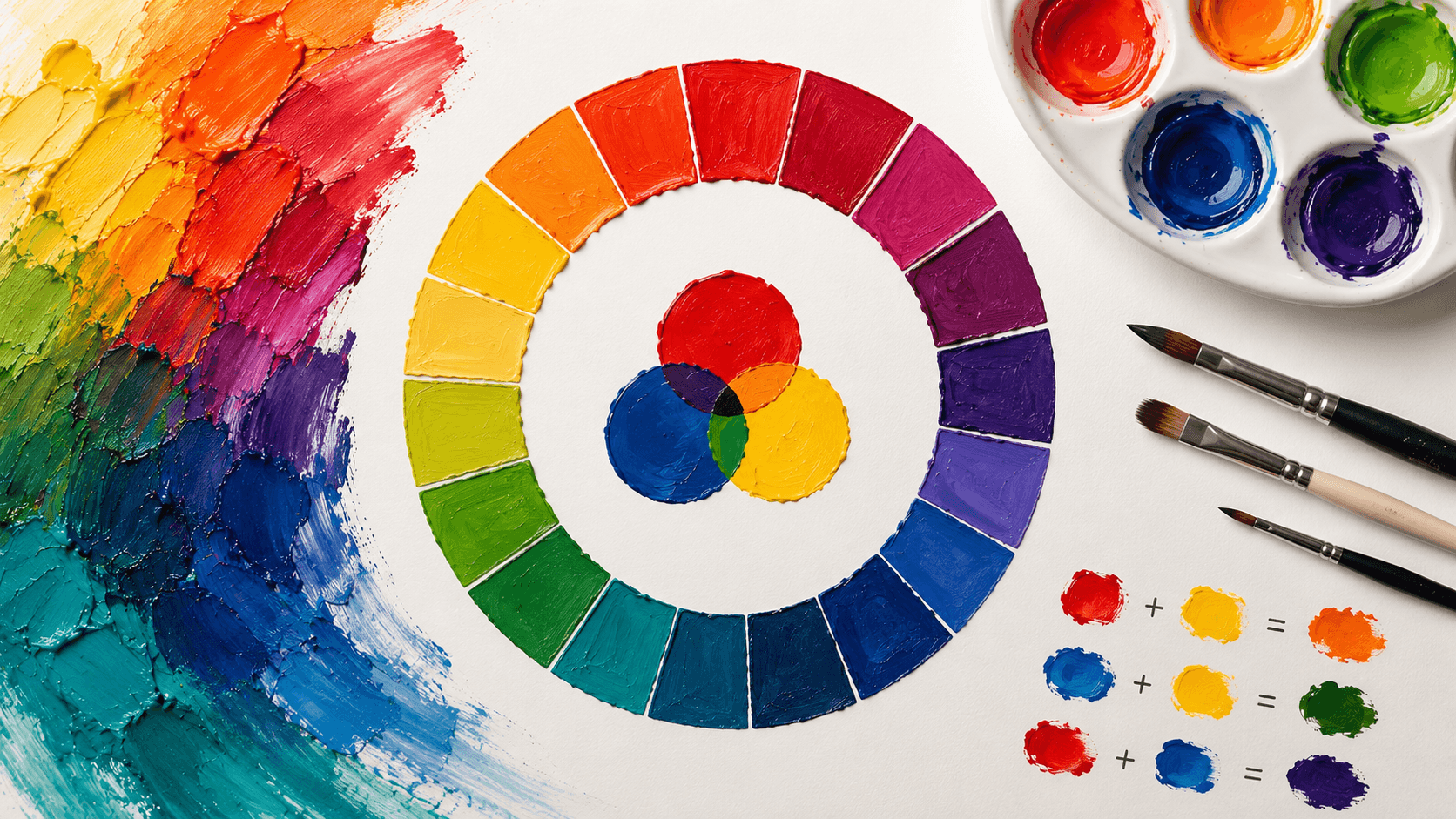
How to Mix Colors: The Complete Guide to Color Mixing in 2026
Color mixing is both science and art. Done right, it unlocks endless shades from just a few tubes of paint. Done wrong, it produces muddy browns that frustrate beginners and waste materials. This master guide combines traditional color theory with modern practical techniques so you can mix any color you need with confidence.
Why Learning How to Mix Colors Matters in 2026
Understanding how to mix colors saves money, reduces waste, and gives you complete creative freedom. Instead of buying dozens of pre-mixed paints, a limited palette plus solid mixing skills lets you create virtually any shade.
Artists, designers, hobbyists, and even digital creators benefit. Physical paint mixing teaches you how colors behave, which improves your use of digital Color Palette Generators and design software.
There are two fundamental systems:
- Subtractive mixing (paints, pigments): adding colors makes them darker as they absorb more light.
- Additive mixing (light, screens): adding colors makes them brighter toward white.
Most hands-on work uses subtractive mixing based on the traditional RYB (Red-Yellow-Blue) model.
Primary, Secondary, and Tertiary Colors Explained
Primary colors cannot be created by mixing other colors. In traditional painting they are red, yellow, and blue.
Secondary colors come from mixing two primaries equally:
- Red + Yellow = Orange
- Yellow + Blue = Green
- Blue + Red = Purple / Violet
Tertiary colors (also called intermediate colors) add nuance. Mix a primary with a neighboring secondary, such as red-orange, yellow-green, or blue-violet.
Color Mixing Chart Reference
Color mixing chart reference for the most searched questions:
- What colors make red / What two colors make red: Red is a primary. You cannot create true primary red from other colors. In modern printing you can approximate it with magenta + yellow.
- How to make the colour yellow / How to make yellow colour: Yellow is primary. Adjust with white for tints or a touch of orange for warmer versions.
- Red and blue make what colour: Purple or violet. More blue creates cooler violets; more red makes magenta tones.
- Blue and yellow make what colour / What colour does yellow and blue make: Green. Cool versions of each produce bright greens.
- Red and green make what colour / Red and green paint make what color / Green and red mixing: Muddy brown or neutral gray-brown (complementary colors neutralize each other).
- What color does red and yellow make / What two colors make orange / How to make the orange colour: Orange. More yellow for peach tones, more red for deep burnt orange.
- What colour does yellow and red make: Orange.
Subtractive vs Additive Color Mixing
Subtractive (RYB / Paint): Pigments absorb light. Mixing more colors moves toward black/brown. This is why red and green make what colour brown instead of a new bright hue.
Additive (RGB / Light & Screens): Combines light. Mixing moves toward white. Your Color Palette Generator and monitors use RGB logic, which is why screen colors often look different when mixed in paint.
Understanding both prevents disappointment when translating digital palettes to physical media.
Essential Color Mixing Techniques and Pro Tips
- Always add dark to light: Put the lighter color on your palette first, then gradually add the darker one. It is much easier to darken than to lighten.
- Mix small test batches: Never mix large amounts until you have tested on scrap material.
- Understand color bias: Every paint has a subtle bias (warm or cool). A warm red (orange bias) mixed with a cool blue produces different results than a cool red with a warm blue.
- Clean tools religiously: Dirty brushes or water quickly muddy fresh mixes.
- Work in layers: Build color gradually rather than trying to hit the exact shade in one go.
- Document your mixes: Create your own physical color mixing chart for future reference.
Common Mistakes to Avoid:
- Over-mixing on the palette (creates flat, dead colors).
- Using too many colors at once (increases chance of mud).
- Ignoring temperature (warm + cool versions of the same hue mix better for certain results).
Advanced Color Mixing: Neutrals, Skin Tones, and Earth Colors
Complementary mixing is your secret weapon for neutrals. Mix opposites (red + green, blue + orange, yellow + purple) to create sophisticated grays and browns.
Skin tones often start with orange or peach bases, then get toned down with small amounts of blue or green, and lightened with white. Experimentation is key because skin varies widely.
Creating Your Own Color Mixing Chart
A personal color mixing chart is one of the best investments you can make. Paint a grid showing each primary and secondary mixed with every other color in varying ratios. Keep it in your workspace for quick reference.
Using a Digital Color Palette Generator with Physical Mixing
Digital tools excel at previewing harmonious combinations before you touch paint. Use a Color Palette Generator to explore schemes, then apply the physical mixing principles in this guide to recreate them in real media.
ReverseToolkit’s Color Palette Generator lets you test thousands of combinations instantly, including those based on the exact mixing relationships covered here. No account required. Try it here: Color Palette Generator
Color Palette Generator
Extract colors from images or generate perfect matching palettes instantly.
Try Color Palette Generator NowFrequently Asked Questions
What colors make red?
Red is a primary color. You cannot create true primary red by mixing other colors, though magenta plus yellow can produce red-like shades in some systems.
How to make the colour yellow?
Yellow is a primary color. Lighten it with white or warm it slightly by adding a small amount of orange.
Red and blue make what colour?
Purple or violet. Adjust the ratio and specific hues for different shades.
Blue and yellow make what colour?
Green. Cool blues and cool yellows produce the brightest greens.
Red and green make what colour?
A muddy brown or neutral tone. Artists use this intentionally for realistic shadows and earth colors.
What two colors make orange?
Red and yellow.
How do you use a color mixing chart?
A color mixing chart shows systematic results of combining your paints. Create your own reference grid for quick lookup while working.
Mastering how to mix colors is a skill that improves with deliberate practice. Combine strong fundamentals, a good color mixing chart, awareness of color bias, and a reliable Color Palette Generator, and you will gain unlimited creative freedom.
Start small, document your successes, and watch your color confidence grow dramatically in 2026 and beyond.