
Best Resume Fonts in 2026: Size, Style and ATS Tips
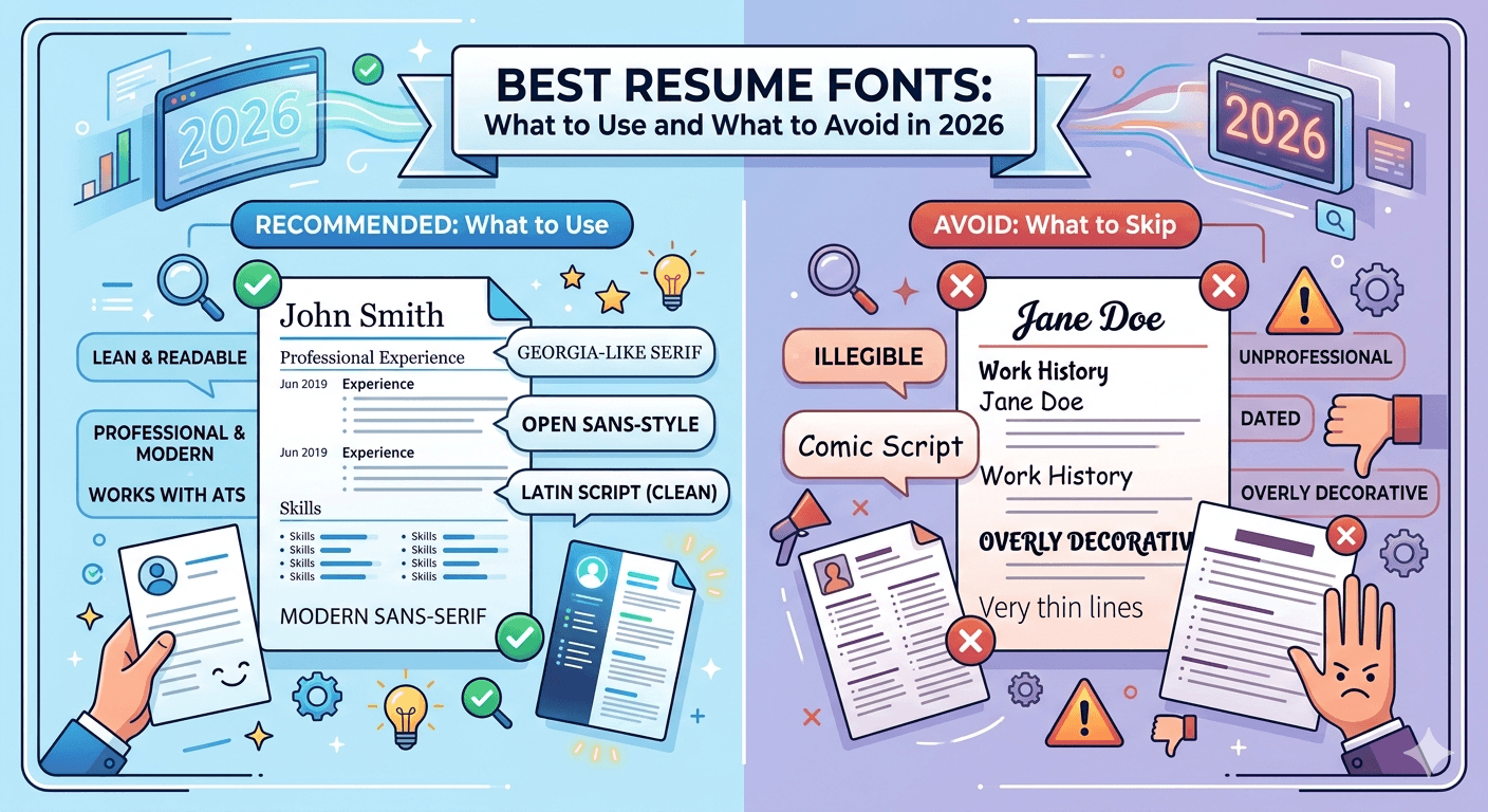
Font choice is one of those resume decisions that most people make once and never revisit. The problem is that the wrong font can trigger ATS parsing errors, make your resume harder to read, or signal to a hiring manager that you made choices based on aesthetics rather than function. The right font does none of these things. It simply stays out of the way and lets your content do its job.
This guide covers the best fonts for resumes in 2026, the right sizes for each section, what to avoid, and why font choice matters more than most candidates realize.
Why Font Choice Matters on a Resume
ATS compatibility. Most large employers and recruiting firms use applicant tracking systems to scan resumes before a human reads them. Unusual or decorative fonts can cause ATS software to misread or skip text entirely, dropping keywords that should have matched the job description. A resume that looks beautiful in PDF form can fail ATS parsing if it uses the wrong fonts.
Readability under speed reading. Hiring managers spend an average of six to eight seconds on an initial resume scan. Fonts that are difficult to read at a glance, whether too thin, too decorative, or too small, create friction that works against you.
Professional impression. Font choice signals design judgment. A resume using a font associated with children's books or greeting cards undermines an otherwise strong application. A clean, professional font reinforces the impression that you make considered decisions.
Cross-platform rendering. A font that looks perfect on your Mac may render differently on a Windows machine or inside an ATS viewer. Sticking to widely available fonts eliminates this risk.
The Best Resume Fonts in 2026
Calibri
Calibri is the default font in Microsoft Word and one of the most ATS-friendly fonts available. It is clean, modern, and highly readable at small sizes. Its rounded letterforms make it slightly warmer than strictly geometric sans-serif fonts without sacrificing professionalism.
Best for: Most industries, corporate roles, technology, finance, healthcare.
Recommended size: 10 to 11 points for body text, 12 to 14 for your name and section headers.
Arial
Arial is a neutral, widely available sans-serif font that renders consistently across virtually every platform and ATS system. It is not the most distinctive choice, but it is one of the safest. If you want zero risk of rendering issues, Arial is a reliable default.
Best for: Corporate, administrative, operations, and any role where a conservative presentation is appropriate.
Recommended size: 10 to 11 points for body text, 12 to 14 for headers.
Garamond
Garamond is a classic serif font with centuries of use in professional publishing. On a resume, it reads as polished and traditional without being stuffy. It is slightly more condensed than some other serif fonts, which means it fits more text on a page without looking cramped.
Best for: Law, finance, academia, consulting, communications, and industries where tradition and formality carry weight.
Recommended size: 10.5 to 11.5 points for body text. Garamond runs slightly smaller than sans-serif fonts at equivalent sizes, so go up half a point from what you would use in Arial or Calibri.
Georgia
Georgia was designed specifically for screen readability, which makes it one of the best serif options for resumes that are read digitally rather than printed. It is slightly larger and more open than Garamond, which makes it easier to read at smaller sizes on screen.
Best for: Communications, writing, education, nonprofit, and roles where the resume is likely to be read on screen rather than printed.
Recommended size: 10 to 11 points for body text.
Cambria
Cambria is a serif font designed to pair well with Calibri, and the two are often used together in professional documents. It is highly readable on screen and in print, with strong letterform distinction that makes it easy to scan quickly.
Best for: Finance, consulting, legal, and any formal or document-heavy industry.
Recommended size: 10 to 11 points for body text.
Helvetica
Helvetica is one of the most used fonts in professional design worldwide. On a resume it communicates clean, modern confidence without any decorative distraction. The main limitation is that Helvetica is not installed by default on Windows machines, which means it may substitute to Arial in some environments. If you are on a Mac and plan to submit your resume as a PDF, this is not an issue.
Best for: Design, technology, marketing, creative industries, and startups.
Recommended size: 10 to 11 points for body text.
Times New Roman
Times New Roman gets a mixed reception. It is universally available, highly ATS compatible, and fully professional. The reason it falls in the middle of this list is that it has become so associated with academic papers and default document settings that it can read as a font choice made by default rather than by decision.
That said, in legal, academic, government, and traditional corporate environments, Times New Roman remains a completely appropriate and professional choice.
Best for: Law, academia, government, and traditional industries.
Recommended size: 11 to 12 points for body text. Times New Roman runs small at 10 points.
Lato
Lato is a free Google Font that has become increasingly popular in resume templates because of its clean, modern appearance and excellent readability at small sizes. It is slightly more contemporary than Calibri or Arial while remaining clearly professional.
Best for: Technology, startups, marketing, and industries where a modern aesthetic is valued.
Recommended size: 10 to 11 points for body text.
Note: Confirm the font embeds correctly in your PDF before submitting. Google Fonts sometimes cause rendering issues in ATS systems if not properly embedded.
Trebuchet MS
Trebuchet MS is a humanist sans-serif font with slightly more character than Arial while remaining clean and professional. It is available on both Windows and Mac and renders reliably across ATS systems.
Best for: Communications, marketing, education, and mid-size to large corporate environments.
Recommended size: 10 to 11 points for body text.
Resume Font Size: The Right Size for Every Section
Font size on a resume is as important as font choice. Text that is too small strains the reader. Text that is too large looks like padding.
Your name: 18 to 24 points. Your name is the most prominent element on the page. It should be visibly larger than everything else so the hiring manager can immediately confirm whose resume they are reading.
Contact information: 10 to 11 points. Email address, phone number, LinkedIn, and location. Same size or slightly smaller than your body text.
Section headers (Experience, Education, Skills): 12 to 14 points. Large enough to clearly delineate sections when scanning. Bold is appropriate here.
Job titles: 11 to 12 points. Slightly larger than body text or bold to make them stand out within the experience section.
Body text (bullet points, descriptions): 10 to 11 points. The lower end of this range, 10 points, is acceptable for experienced candidates with more content. 11 points is more comfortable for most readers.
Do not go below 10 points. Below 10 points becomes difficult to read for many people, particularly in serif fonts. If you are going below 10 points to fit content onto one page, the solution is to cut content, not to shrink the font.
Fonts to Avoid on a Resume
Comic Sans. This needs no explanation. It communicates a lack of seriousness regardless of the content.
Papyrus. Decorative, difficult to read in bulk, and associated with informal design.
Impact. A display font designed for headlines, not body text. Compressed and hard to read at small sizes.
Courier New. The monospace typewriter aesthetic of Courier is associated with code and informal documents. It does not read as professional in a resume context outside of very specific niche applications.
Brush Script or any handwriting font. Handwriting fonts are difficult to read in body text and trigger ATS parsing errors because the letterforms do not match standard character recognition patterns.
Any condensed or ultra-light font weight. Very thin or condensed font weights reduce readability significantly, particularly on screen. Stick to Regular, Medium, or Book weights for body text.
Should You Use One Font or Two
One font is almost always the better choice for a resume. Using one font in different sizes and weights, regular for body text and bold for headers and job titles, creates clear visual hierarchy without the inconsistency that comes from mixing font families.
If you choose to use two fonts, pair a serif with a sans-serif for contrast. A common combination is Garamond for headers and Calibri for body text, or Georgia for your name and section titles with Arial for body content. Avoid pairing two fonts of the same type, such as two serif fonts or two sans-serif fonts, as the difference is often too subtle to read as intentional design.
Never use more than two fonts on a resume. Three or more font families creates visual noise that distracts from the content.
ATS Font Safety: What Passes and What Fails
ATS systems parse resume text by recognizing standard characters. Fonts that use unusual ligatures, decorative glyphs, or non-standard character encoding can cause text to be parsed incorrectly or skipped entirely.
Safe for ATS: Calibri, Arial, Georgia, Garamond, Cambria, Times New Roman, Trebuchet MS, Verdana, Helvetica (when embedded in PDF).
Use with caution: Google Fonts including Lato, Roboto, and Open Sans. These are safe when properly embedded in a PDF but can cause issues if the font file is not included in the document.
Avoid for ATS: Any display, handwriting, or decorative font. Script fonts. Icon fonts used in place of text for contact information symbols.
One important note: if you are submitting your resume as a Word document rather than a PDF, the font must be installed on the recipient's machine to render correctly. Stick to fonts that come pre-installed on both Windows and Mac systems to avoid substitution issues.
Formatting Your Resume for Maximum Readability
Font choice is one part of resume formatting. Consistent margins, appropriate line spacing, and clear section structure all contribute to how readable and professional your resume appears. ReverseToolkit's resume builder handles the formatting layer automatically, so you can focus on content while the layout stays clean and consistent. No account required. Try it at ReverseToolkit Resume Builder.
Frequently Asked Questions
What is the best font for a resume in 2026?
Calibri, Arial, Georgia, and Garamond are the strongest choices for most candidates in 2026. Calibri is the safest all-around option because it is ATS compatible, widely available, and reads cleanly at small sizes. Garamond is the best choice for traditional or formal industries. Georgia works well for resumes that will be read primarily on screen.
What font size should a resume be?
Body text should be 10 to 11 points. Section headers should be 12 to 14 points and bold. Your name at the top should be 18 to 24 points. Do not go below 10 points for any body text on your resume.
Is Times New Roman good for a resume?
Yes, with reservations. Times New Roman is ATS compatible and professional. The concern is that it can read as a default choice rather than a deliberate one. In legal, academic, and government contexts it is completely appropriate. In technology or creative industries, a cleaner sans-serif like Calibri or Arial makes a stronger impression.
Can I use a Google Font on my resume?
Yes, but with caution. Google Fonts such as Lato, Roboto, and Open Sans are clean and professional. If you use one, make sure it is embedded in your PDF export so it renders correctly on any machine and in any ATS viewer. Test by opening the PDF on a different computer or in a PDF viewer that does not have the font installed.
Should I use the same font for my resume and cover letter?
Yes. Using the same font across your resume, cover letter, and reference page creates a cohesive, professional set of documents. It signals attention to detail and consistency, both qualities hiring managers value.
Resume font choice is a background decision. When it is made well, nobody notices it. The content reads clearly, the document looks polished, and nothing distracts from the qualifications you are presenting. When it is made poorly, it creates friction, triggers ATS issues, or signals poor judgment before a single word of your experience has been read. Choose a font from this list, set the sizes correctly, and then put your energy into the content that actually gets you the interview.