
Complementary Colors & The Color Wheel 2026
Key takeaways
- ▸Complementary colors sit directly opposite each other on the color wheel and create maximum contrast. Red opposites green, blue opposites orange, and yellow opposites purple.
- ▸Use them to make designs pop or to neutralize colors when mixing paint.
- ▸This guide shows exactly how to use color opposites effectively with a Color Palette Generator.
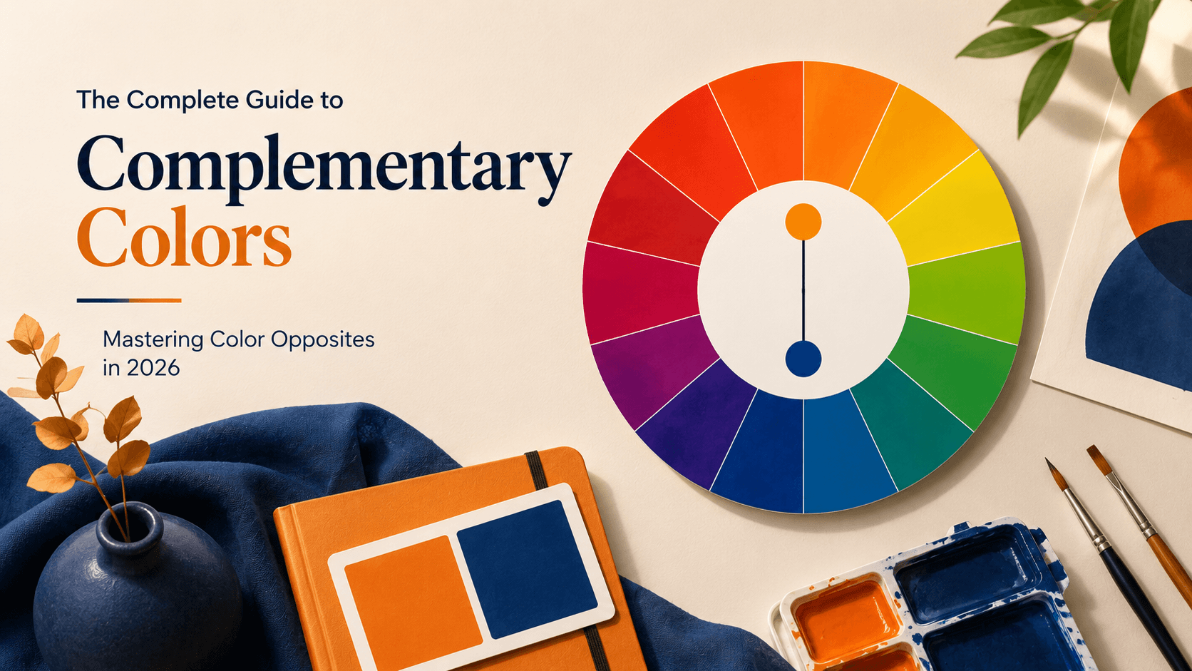
The Complete Guide to Complementary Colors: Mastering Color Opposites in 2026
Complementary colors are among the most powerful and reliable tools in any designer’s or artist’s arsenal. They deliver instant visual energy and tension that can make a design stand out dramatically. However, they are also easy to misuse if you do not understand the underlying principles. This comprehensive guide covers the science, practical application, and advanced techniques professionals rely on in 2026.
Understanding Color Opposites (Complementary Colors)
Complementary colors are pairs positioned directly across from each other on the color wheel. This 180 degree relationship is what gives them their unique power. When placed side by side, complementary colors make each other appear more vibrant and saturated through simultaneous contrast. When physically mixed in paint or pigments, they cancel each other out, producing neutral grays, browns, or muted tones. This dual behavior (intensification versus neutralization) makes complementary colors incredibly versatile for both creative expression and technical color correction.
| Base Color | Complementary Opposite | Best Uses | Effect When Mixed |
|---|---|---|---|
| Red | Green | Christmas themes, alerts, bold branding | Muted brown / neutral |
| Blue | Orange | CTAs, cinematic looks (teal & orange) | Warm gray |
| Yellow | Purple / Violet | Food packaging, playful retail, creative work | Dull brownish gray |
| Green | Red | Nature vs passion, eco vs luxury | Neutral gray-brown |
| Orange | Blue | Energy & trust, outdoor branding | Muted tone |
| Purple | Yellow | Luxury & creativity, beauty products | Neutral |
Why Complementary Colors Work So Well
- Maximum Contrast Complementary pairs offer the highest level of contrast possible on the color wheel. This makes them perfect for drawing immediate attention to important elements like call to action buttons, headlines, or key visual focal points.
- Vibrancy Boost Placing a color next to its opposite creates an optical illusion that intensifies both hues. This technique is heavily used in advertising, product photography, and packaging design.
- Neutralization in Mixing If you have searched for red and green make what colour, green and red mixing, or red and green paint make what color, the answer lies here. Complementary colors neutralize each other. Artists deliberately use this property to create realistic shadows, skin tones, and sophisticated muted palettes.
- Emotional and Psychological Impact Red plus Green signals high energy and balance. Blue plus Orange combines trust with excitement. Yellow plus Purple pairs optimism with luxury. These combinations tap into deep human responses and work powerfully for branding and visual storytelling.
The Complementary Color Scheme in Practice
A true complementary color scheme uses one dominant color and its opposite as an accent.
The 60-30-10 Rule (Pro Standard): 60 percent dominant color, 30 percent complementary accent, and 10 percent neutrals. This ratio prevents visual fatigue and the vibrating effect that happens when complementary colors compete equally.
Advanced Technique: Split Complementary Colors
When pure complementary contrast feels too strong, use split complementary colors and split complementary color scheme. Choose your base color, then use the two colors adjacent to its direct opposite. Example: Base color Blue, direct opposite Orange, split complementary Yellow-orange plus Red-orange. This method is very popular in modern web design because it offers strong contrast with better harmony.
Color Opposites Across Different Industries in 2026
- Web Design: Orange buttons on blue backgrounds often achieve higher conversion rates.
- Branding: Complementary pairs create memorable logos.
- Interior Design: Warm and cool opposites create balanced rooms.
- Fashion: High contrast outfits make strong statements.
- Painting and Illustration: Opposites help create depth and focal points.
- Film and Photography: The teal and orange look remains popular.
2026 Trend: Muted complementary palettes using softer, desaturated versions of traditional opposites are gaining strong traction for sophisticated everyday design.
Practical Tips for Superior Results
- Test contrast ratios using WCAG guidelines for accessibility.
- Use tints and shades of complements for modern, elegant results.
- Always start with a digital Color Palette Generator before physical work.
- Add complementary colors gradually when mixing paint.
- Consider cultural meanings of color pairs in different regions.
- Avoid large areas of pure saturated complements to reduce eye strain.
ReverseToolkit’s Color Palette Generator removes the guesswork. Input any base color and instantly see its exact complementary opposite, split complementary variations, and balanced palettes. No account required. Try it here: Color Palette Generator
Color Palette Generator
Extract colors from images or generate perfect matching palettes instantly.
Try Color Palette Generator NowFrequently Asked Questions
What color is the opposite of red?
Green. This is one of the strongest and most vibrant complementary pairs with high visual impact.
What is the opposite of blue?
Orange. This combination is widely used in film and digital design for its strong dynamic balance.
What is the opposite of green?
Red. The pairing creates excellent visual tension and works well for both design and paint mixing.
What color is the opposite of yellow?
Purple or violet.
What happens when you mix complementary colors?
They neutralize each other and typically create browns, grays, or muted tones. This is a core technique in traditional painting.
What is the difference between complementary and split complementary colors?
Complementary uses the exact opposite. Split complementary uses the two neighboring colors to the opposite for better harmony while keeping strong contrast.
How do I find the opposite of any color quickly?
Use a dedicated Color Palette Generator that calculates precise color wheel relationships.
Mastering complementary colors and color opposites gives you precise control over contrast, emotion, and visual hierarchy. When paired with a powerful Color Palette Generator, you can create consistently strong, professional work with confidence.
Start applying these principles today. Your next project will feel more intentional, dynamic, and visually compelling.